XAUUSD Trading Fib Expansion Levels
We have looked at Fibonacci retracement in the previous course, drawn between 2 points. But to draw Fibo expansion we use 3 chart points.
To draw these levels we wait until the retracement is complete and xauusd price starts to move in original direction of the Gold trend. Where the retracement reaches is used as point 3.
The example illustrated and explained below shows the 3 Points where the Fibonacci extension is drawn, marked as 1, 2 and 3. 1 is where the gold trend started, 2 is where the gold trend pulled back & retraced & 3 is where the retracement reached as displayed on the xauusd trading example illustrated and explained below.
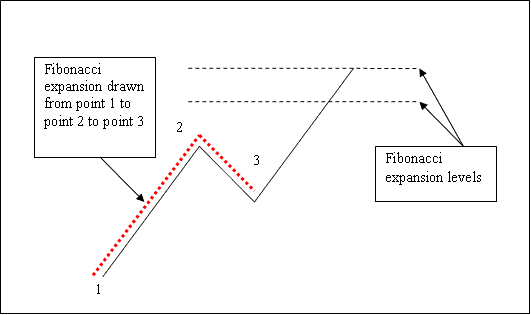
Please note where these levels are drawn - they are drawn above the indicator, these are the points where the trader will place the take-profit orders.
Drawing Expansion Levels on an Upwards Trend
We use Fibo extension levels to estimate where the movement will reach. There are 2 important extension levels: 61.8% & 100 %, these are used for taking profit.
On the examples, below you can see that the Fibonacci extension is drawn along the direction of the trend, since the gold trend is upwards - the expansion is drawn upward.
These levels are displayed as horizontal lines above the technical indicator, showing profit taking areas. In the xauusd example illustrated & explained below if you had used 100% extension you would have made nice profit from the trade.
NB: This is the same trade from the previous example where we used Fibonacci retracement to buy at around retracement level 38.2 %. At the same time we have used Fibonacci expansion 100% to set take profit. Now find a Gold chart & practice these strategies.
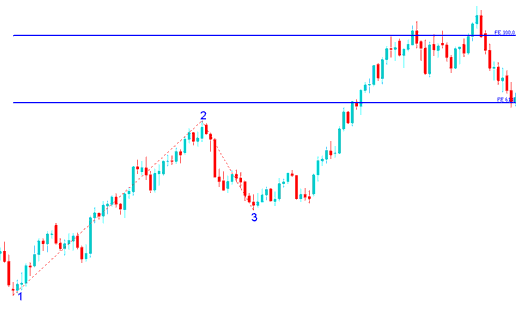
From the above examples, the upward trend continued and both 61.8 % and 100.0 % levels were all hit after which xauusd price retraced again after getting to the 100.00% extension.
Drawing Expansion Levels on a Downwards Trend
Since we use this tool to estimate take profits, how do we draw it in a downwards Gold trend?
We draw it from point 1 to 2 to 3 as shown below. Remember we always draw this tool in the direction of the trend. In the xauusd example illustrated & described below, can you figureout what direction we have drawn it? That's right - downward.
Try & see the difference between how we have drawn it above & how it's drawn below. This time you would also have used extension level 100 %, see just where the price reached. That would have been a nice take profit area.
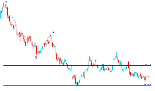
From the xauusd trading example above, after plotting this tool there are 2 levels that are used to show the profit-taking areas, these two are drawn as horizontal lines across the xauusd price chart.